3×
More SaaS products starting to sell each week
By the end of 2025, compared with the beginning of the year.
This reflects Freemius’ broader product, developer-experience, and positioning transformation - not the redesign alone.
Brand & Product Design
Reimagining Freemius across brand, website, and product, creating one visual system for software makers at every stage, from launch to scale.
Role: Lead Brand & Product Designer - External
Scope: Brand Identity · Visual System · Website · Product Design
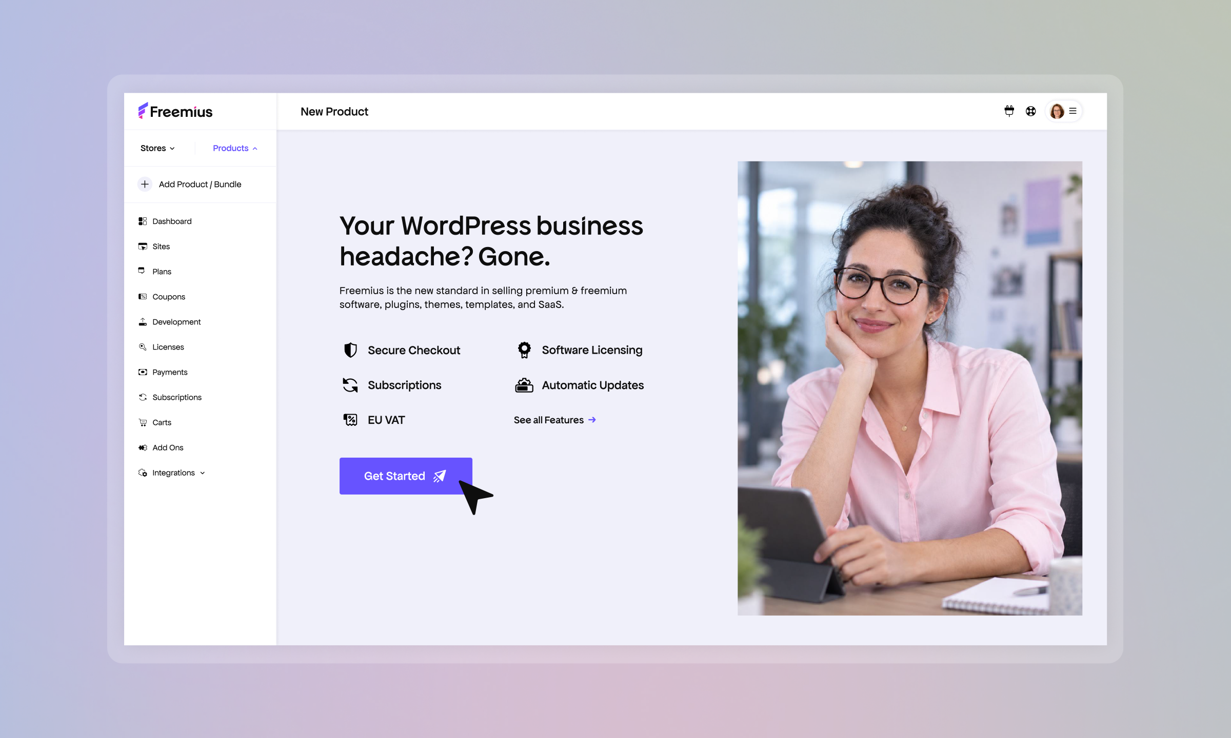
Freemius had grown from a WordPress-focused business into a broader platform for software makers, but its identity, website, and product experience no longer felt connected.
Working with the Head of Brand on business, audience, and positioning direction, I led the visual identity from concept through execution and independently redesigned the Developer Dashboard. The result was a scalable system connecting brand, website, marketing, and product.
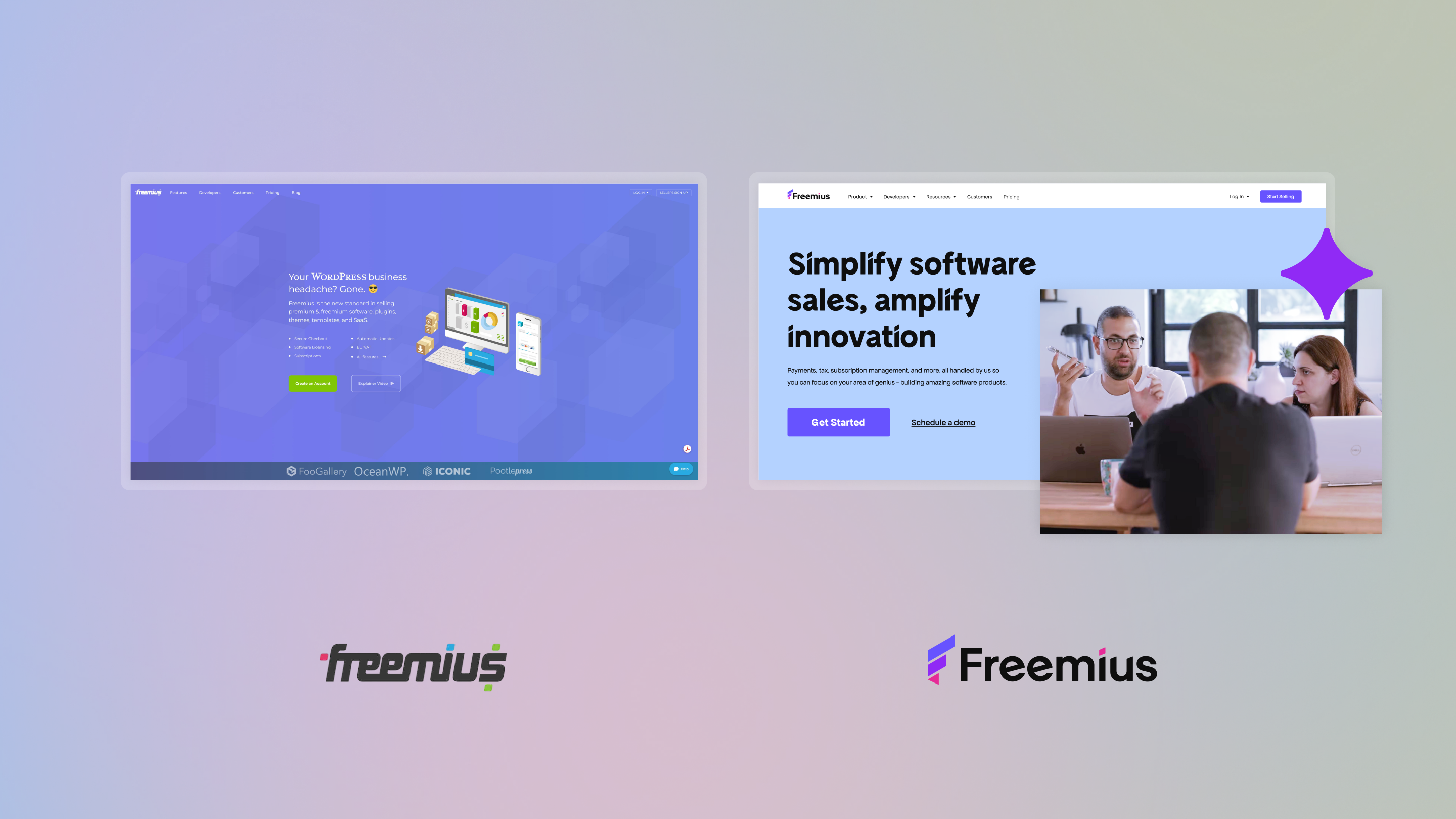
Freemius needed to speak to software makers at different stages of maturity - from creators launching a first product to businesses growing revenue, customers, and operations.
The identity had to feel ambitious and energetic in marketing, while remaining clear and trustworthy in more functional contexts.
That challenge became the foundation for the brand concept: Launch, Grow, and Scale.
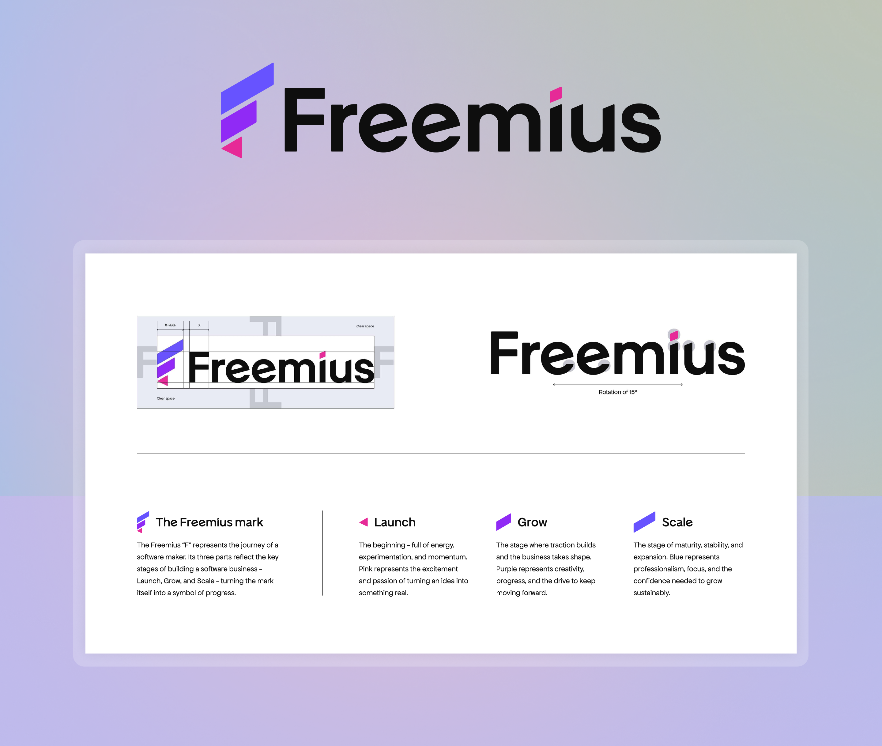
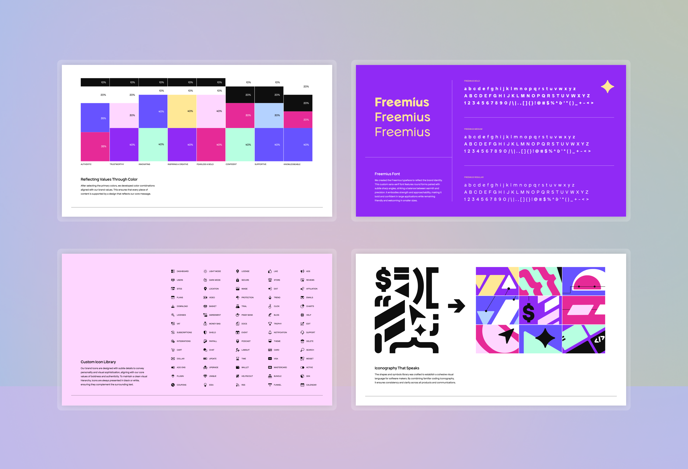
I translated the core concept into a system that could scale across touchpoints.
The Freemius “F” is built around three stages in a maker’s journey - Launch, Grow, and Scale - expressed through form and color. Around that, I developed a broader system of typography, color relationships, iconography, and graphic elements designed to feel bold, friendly, and recognizable.
The goal was not just to create a logo, but to build a system the brand could keep using and expanding over time.
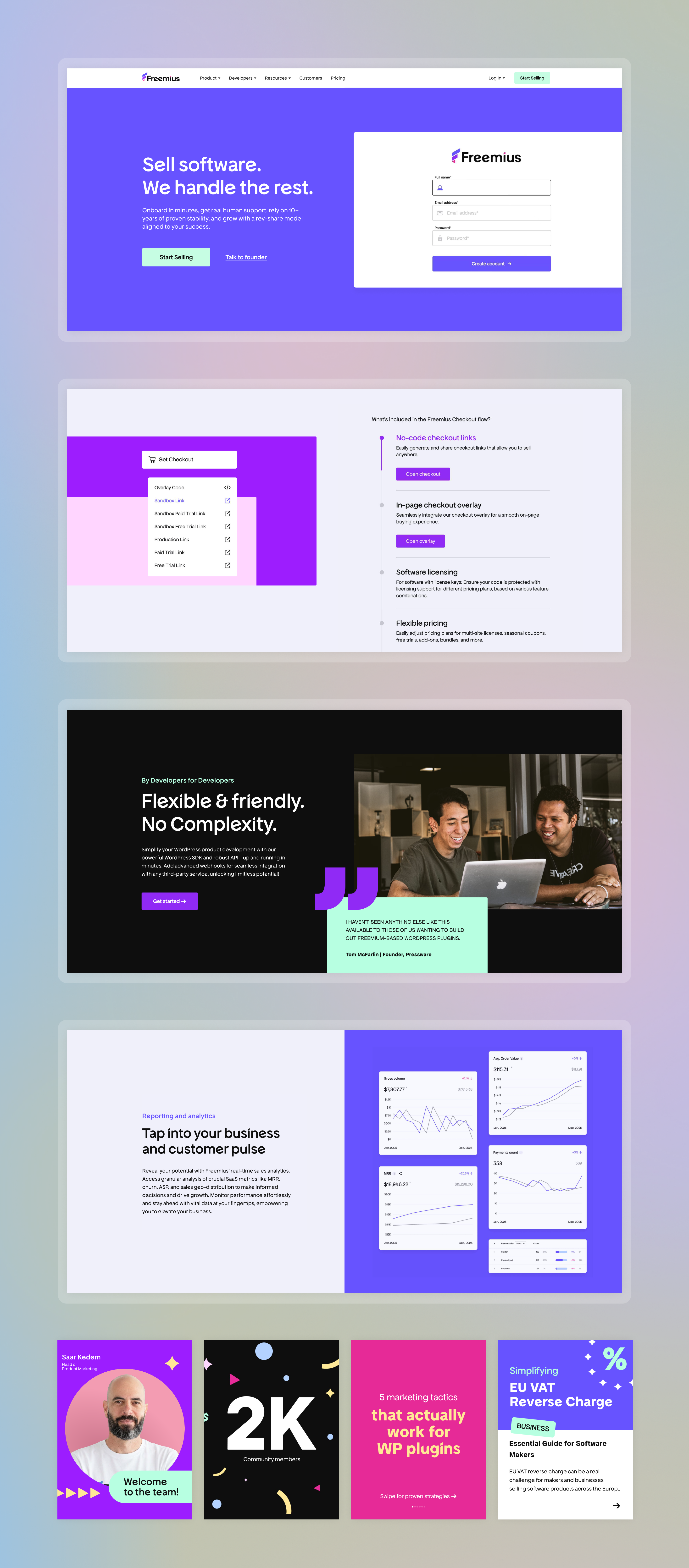
The rebrand was designed to work in the real world, not just in a brand book.
I applied the system across the website, product storytelling, educational sections, social assets, and community content. The result was a more coherent and expressive digital presence that made the product easier to understand and the brand more memorable.
This part of the project was about proving that the identity could remain consistent while adapting to many different formats and communication needs.
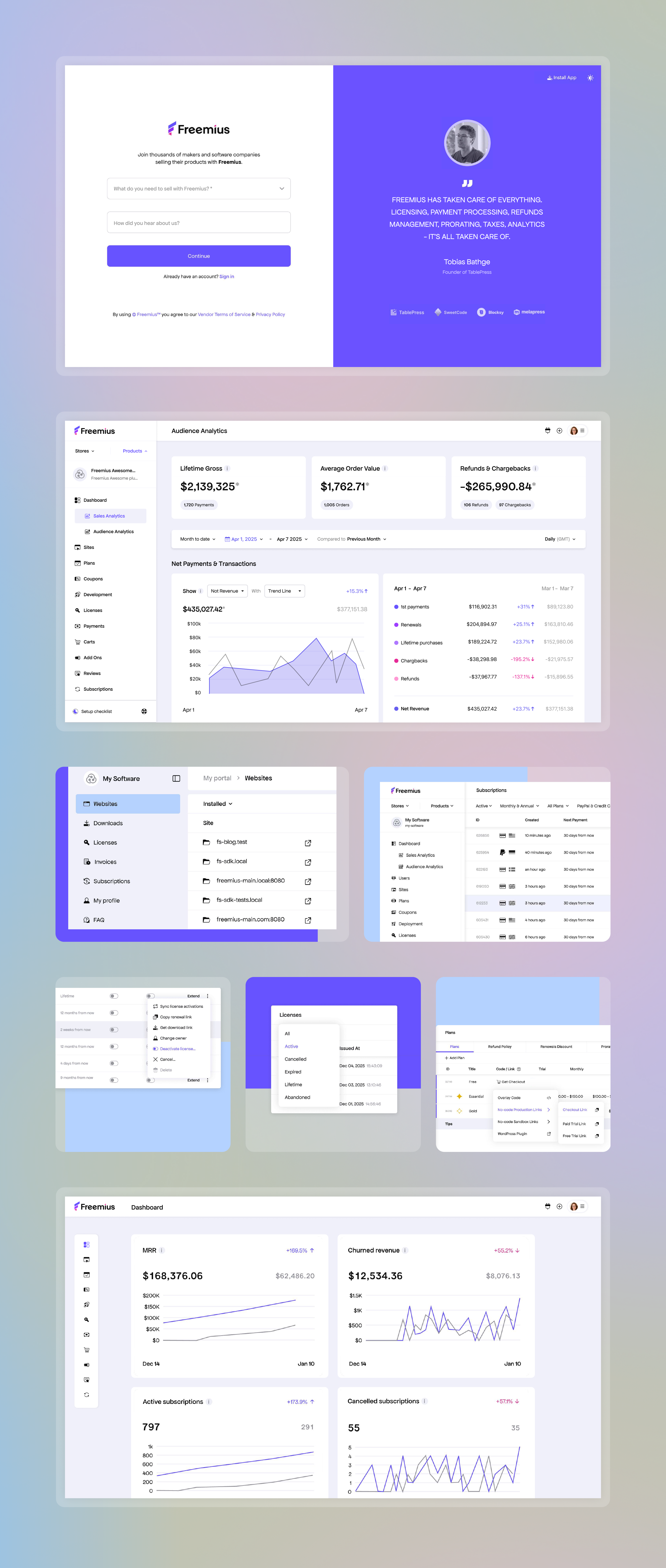
Alongside the rebrand, I redesigned key product surfaces to create a cleaner and more consistent experience.
This included dashboards, tables, onboarding flows, analytics views, settings, and management states. The goal was not to make the product louder - it was to bring the clarity and structure of the new identity into a data-heavy system, making it easier to scan, navigate, and use.
This helped connect the visual language of the brand with the practical needs of a business product.
OUTCOME
The new identity created a shared visual language across brand, marketing, and product - giving Freemius a more coherent foundation as the company expanded beyond its WordPress roots.
3×
By the end of 2025, compared with the beginning of the year.
This reflects Freemius’ broader product, developer-experience, and positioning transformation - not the redesign alone.
ONE SYSTEM
A shared visual language replaced a fragmented experience and created a foundation the team could continue extending.
BUILT TO SCALE
The new identity supported Freemius’ evolution from a WordPress-focused platform toward a broader audience of software makers.
Next Project